Friday, December 23, 2011

Happy Holidays 2011!

Season's Greetings, everyone!
Many of you will have wondered if I'd gone permanently MIA?.. It's been literally months since I've posted anything on this Blog. And for that, I do apologize. That said, I do have a few excuses for my absence..
I've had vision problems in my Right Eye. And drawing/inking was becoming increasingly difficult to manage, which certainly put a damper on my creativity/productivity. A couple months ago, I found out from my Eye Doc that I'd developed a cataract in my Right Eye. So, I'll be having implant surgery on January 3rd!
When I had a pre-surgery appointment with the surgeon, they also discovered a small hole in the retina of my Left Eye. That was solved relatively easily, with some uncomfortable Laser surgery. But I also needed to have a complete physical done by my G.P. prior to the upcoming surgery.. And of course, he had to find that I had "elevated" blood pressure. Mild hypertension, I think they call it?..
So, now I got pills for that. But it seemed that if I wasn't sitting in a medical waiting room, I was driving to different appointment.. Exhausting & frustrating! Getting my Right Eye fixed will make me a very happy camper, come mid-January!!

I had a couple small freelance jobs to get to, before I could start my own card. But now, I'm happy to present to you the 2011 version of my annual Holiday Card..
As you can see, I went with a very "traditional" approach this year; based on some of the vintage cards that I'd seen on eBay over the years..  I was in a real hurry, so I wanted a very simple and uncomplicated layout to work with.
I really like those 50's-era Santa designs from years gone by. In fact, I used some of the same reference material from the Holiday Card that I did back in 2004.. He's got the same wide bug-eyes, but the overall proportions are a little more realistic, this time 'round.
The coloring is mostly traditional.. Marker base coat, with pencil crayons on top. And then some digital "tweaking" and a Background, added inside Photoshop..

The printers at Kinko's did a bang-up job for me, and I had my Cards done in the early hours of December 22nd.  Obviously, a few recipients won't be getting them before this weekend. But at least they'll be postmarked prior to Christmas. I try..
For my Internet friends, I hope that this "digital" -version of the Card will suffice.. Y'know, I loves alla youse!

Anyways, this is one of my favorite times of year: getting together with friends & family.. Best Wishes to everyone at Christmastime!.. And here's hoping you'll all experience a fantastic 2012!!

Tuesday, September 13, 2011

Kevin Klis, R.I.P.

When you're a child, you hold to this idea that only elderly people die.. But as you get older, you realize that this isn't the case. And as I rapidly approach my own half-century mark, I've begun to lose some very dear friends! One of those, was an artist named: Kevin Klis. He passed away last month at the age of 46, after a lengthy struggle with lung cancer..

Kevin was a couple years younger than me, but we found we had many similar interests. We first met in 1983, when we both attended Sheridan College's 'Classical Animation' program.. As 1st Year students, we were assigned neighboring animation desks. So it's no surprise that we became quickly acquainted. Rather than live in Oakville, we both chose to travel to-and-from college, via the GO Train. Myself, from Scarborough. And Kev from a little further east, in Pickering/Ajax. As a result, we spent most our school days together..

Initially Kevin told me that he had little interest in animated cartoons.. He was only interested in how the program would make him a better comic-book artist. Sheridan had shut down it's own 'Cartooning' program a few years earlier, much to his chagrin..
I had pretty much forgotten about comic-books, myself. But still had fond memories of the ones I once owned as a kid. Kevin was a huge Neal Adams fan! Particularly, Adams' work on 'The BATMAN' title.. Kevin knew where all the good comic-book shops were on Queen Street West. So, when we both didn't have afternoon classes (and sometimes when we did! hah), we'd both agree to make a book shopping junket, before continuing on to Oakville.
I spent most of my money re-buying all of the old comic-books I'd once owned. In addition, we both became pretty excited by the more-adult stuff published in 'HEAVY METAL' and 'EPIC' magazine..

Through some scheduling quirk in Sheridan's 1st Year programming, students were allowed to work on a Group Film. Usually a project reserved for 2nd Year students.. Kevin and I decided that we'd try to make a short film using the characters we'd seen in 'EPIC' magazine: Arthur Suydam's 'CHOLLY & FLYTRAP'..
We came up with a contrived storyline entitled: "The Repercussion"; about 'CHOLLY' shooting a few snail characters. I can recall that Kevin did an amazing Run Cycle, that I did a BG for.. Kevin had taken the time to cel-paint these cycled drawings, using a white oil-based house paint. Shooting it all toplit under the camera, it all looked very good. But in short order, the oils began seeping out of the applied paint. And Kevin found all of his cels gummed together!
I have very little of Kevin's artwork.. But here are a few of Kev's layout sketches from that project:

That's 'CHOLLY' in the last panel, in the cockpit of his flying vehicle.. Kevin added a few tourist stickers. One, from a trip to Florida. And along the dash, ones for Hollywood and Disneyland! hah

By the time we got to our 2nd Year Group Film project, we were a little more serious about things.. Disney-style cartoony animation, wasn't really our thing. We both preferred the Fleischer 'SUPERMAN' shorts.
On top of that, we were both huge Frazetta fans.. In 1983, the animated 'FIRE AND ICE' feature made with Ralph Bakshi, came out.. And a year before that, Milius' 'CONAN' came out.. We still had Frazetta on the brain, so we decided to try and make a film about a gladiator-styled "Pit Fight"..
Kevin not only designed our "hero" character. But had the audacity to sculpt himself a small maquette to help him draw the character from multiple angles! I don't have a photo of the sculpture, but here's what Kevin's model sheet looked like:
Kevin always spent a good deal of time deciding on a character's "name".. I didn't think it was a big issue, but I could tell it was very important to him. Perhaps because his character was a bit Germanic-looking and had long blond hair, Kev settled on: "Kruger"..
I was supposed to handle scenes with our "villain". And was less-interested in what he'd be named. Perhaps that's why we never called him anything beyond: "the Brute".. My designs for "Brute" don't have Kevin's flair, but here's basically what he looked like:
We knew that the amount of work involved to get everything finished, would be gargantuan. Even so, we felt like if we could get enough of the film done to show our teachers the "potential" of our project, we'd pass the Review process at year's end. We didn't spend too much time on plot/story. But we knew the sequence of the scenes needed. And the choreography necessary, for what was essentially an animated "fight scene"..
Here's a page of Notes that I unearthed:
I couldn't find any model sheets showing the scale between these 2 characters.. But I suppose it's important to mention that "Kruger" was literally supposed to be about half the size of "Brute". We wanted to establish early on, that the cards were heavily-stacked against our hero! Kev had some great shooting ideas for playing with this sense of contrast.. Here are a few of his layout sketches:
Now somewhere along the way, our production got sidetracked with (what we concluded) was an innovative foray into "rotoscoping" technology.. Occasionally during our lunches, we'd make a trip over to a nearby Oakville mall to go shopping for toys & videos, etc. During one of these junkets, we came across some Fisher-Price Viewers that would allow you to pop in a plastic cartridge and view short animated clips from various studios. I can recall buying a couple Disney ones. I think "Clock Cleaners" was one. Another was about a "Haunted House"..
Having been an avid Super-8 filmmaker in high school, I guess my curiousity got the best of me. And I wanted to find out how the damn things worked.. So, I slowly pried one of the plastic cartridges opened. And was amazed to find that the Viewers used super-8mm clips, in a closed loop. Maybe 30 seconds worth total..
I suggested to Kevin that if we could shoot some live-action reference of each other, portraying the action we needed for our scenes.. it'd be really helpful! I already had the super-8 camera. All we needed was to build a few flimsy props & simple costumes..
Here's a rough tracing of me, from live-action. With the translated animated version of "Brute", for comparison:

Anyhoo, long-story-short.. We actually did shoot all the live-action film in a spare room at the college. And used it all for direct reference. But the time wasted on this ambitious venture, really put us behind the 8-Ball, schedule-wise. Basically, we just envisaged a grand meal that was just a little too big for our plates! But isn't that what college kids do best?.. Imagine & Dream..
While our teachers admired the scale/scope of our ideas.. There simply wasn't enough finished animation footage available to assess, for them to allow myself and Kev to graduate to 3rd Year. To our great disappointment, we both would have to repeat our 2nd Year.
Halfway thru my "repeat" year, my interest in animation was waning. I dropped out to work at a comic-book shop in Toronto. Kev continued on, and eventually graduated the program. Later on, I helped him get a job at 'Andromeda'; a comic-book distributor. Eventually, he'd return the favour and get me a Layout Test opportunity at Nelvana. Where in 1989, we both got our start in the Animation business, working on their "Beetlejuice" cartoon series!
In 1995, I began working as a Freelance artist, under my own company name. Kevin continued on at Nelvana; but would often "moonlight" doing work for the same studios I worked at. We remained good friends, though I saw him substantially less than I once did. I know he had many other friends too, as attendance at his funeral clearly attested.
Kevin was always a friendly and helpful guy. If there was a bitter side to his personality, then I never saw it. On top of that, his artwork was always top-notch and superbly executed. I've seen a lot of fellow artists "hack" out work; especially as they got older. I never saw evidence of that with Kevin. He took pride in everything he commited himself to. I will miss him, very much..

Wednesday, July 20, 2011

Stumble into my TUMBLR!

Hello!

It's been more than 3 weeks,-- so I guess it's time for a Blog post? In case you hadn't noticed it yet on my personal Blog links, I've broken down and finally joined the current Tumblr craze..
I'm a pretty active Blogger, but bypassed the whole MySpace experience. And I'm not enough of a narcissist to tweet all day-and-night about myself, and become a Twitter twit.. But I do find social networking sites useful. And regularly use both Facebook and LinkedIn to keep in contact with Friends and people I'd like to be friends with!

I've decided that while the Burlesque/Striptease postings here on my Blog have been fun to do.. They actually don't "fit" theme-wise here, in what was initially intended to be an online showcase for my own personal artwork? I don't intend to pull any of my previous Blog posts down. But will now be using my Tumblr exclusively, for any and all posts on that part of my collecting hobby. I guess unless it specifically pertains to my artwork, too. Which is always a possibility..

Like this old sketchbook drawing of 50's-era showgirl: "IRMA The Body"..
Judging by the stats on my blog's SiteMeter, I get a fair number of visits from websurfers looking for information or images on specific Burlesk performers of the past.. If that's your thing, like it is mine.. Then I hope you'll take an added trip over to my Tumblr.. I've spent time scanning & posting parts of my obscenely-large collection over there. And I hope you'll find it as interesting as I do?

You can get there by clicking here!     Thanks.

Thursday, June 23, 2011

Illustration Friday: "LAUNCH"..

Well, I'm getting a bit better at my "Illustration Friday" participation.. I actually got to the "inking" stage, this time 'round! I had hoped to add some color, too. But I have some urgent freelance work, that's going to prevent that idea. Maybe next time?
Here is my entry for the this week's Theme: "Launch".

Earlier in the week, I'd stumbled across a Tumblr that had a cute photo of a little tyke in a crazy retro Space Helmet, gazing intently upon a Toy Rocket. Serendipity, or Synchronicity? I dunno, but I took it as a cue for my drawing, here..
Here's what the Final Art ended up looking like:
As you can see,-- I used a combination of col-erase pencils and ink. I'm fairly happy with the results. The drawing came together quickly, with only a few probs. More disconcerting to me, was the trouble I had with the inking. My old eyes just aren't what they used to be, I guess. And even with relatively-new reading glasses, I still had trouble seeing the smaller details. Thank God for Photoshop, eh?! hah
I think I can credit the facial expression to my heavy Wally Wood influence. But I also see a bit of Rick Geary here, too. That came as a bit of a surprise to me, as I haven't looked at his artwork in a very long time..
Hope you enjoy seeing this one!

Many thanks, for dropping by.. See ya, next time!

Thursday, May 26, 2011

Illustration Friday: "SOAKED"..

Hello!

It's been awhile since I participated in an "Illustration Friday" .. But here is an entry for the this week's Theme: "Soaked". For whatever reason, I imagined a poor Clown being soaked by a bunch of misfit kids. Perhaps the setting is an oldtime kid's show like "Howdy Doody", where a bunch of audience members are allowed to soak "Seymour The Clown" with a bunch of different spraying devices? I dunno. Who's to say where inspiration flows from..

Here's what it ended up looking like:
I didn't bother inking or coloring this one. Not enough time, currently. And the drawing has a few probs. But on the whole, I'm fairly happy with the way it turned out. It has the Wally Wood/MAD magazine qualities that I was hoping for, at least.

Thanks, for visiting my Blog.. See ya!

Monday, May 2, 2011

FF's 50th Anniversary!

Many moons ago, I roughed-out a sketch of the entire 'FANTASTIC FOUR' group.. I'd bought a few of the Kirby/Sinnott ESSENTIAL trade paperbacks earlier; and found them really inspirational. That vintage artist team seemed to really click, on the series. And Joe Sinnott's slick inking, really made Kirby's pencilling sing!
Realizing that my original Layout would likely require some finessing, if I wanted all of the compositional elements to work.. I thought it'd be a good idea to put each character on a seperate page. They turned out pretty good, I thought. But unfortunately, I never got 'round to adding a background. Eventually I sold them all off thru a series of eBay auctions; promoting my 2003 self-published sketchbook..

More recently, I read that the 50th Anniversary of the FF would be one of many "themes" featured in the Souvenir Program Book at this year's San Diego Comic-Con.. So, I dragged out my old FF artwork & sketched out a Background that'd work behind what'd already been done.
There were parts of the old artwork that I was never quite happy with.. So, in addition to adding a background, I decided to "fix" stuff like Reed Richard's outstretched arm. As well as give The Thing a "new" face. Here's what I came up with:
It looks a bit odd, with some parts still missing.. But drawing all the Kirby -type machinery/gear, is always great fun.. And because I had the character placements already blocked-out, I was able to (hopefully) spot additional elements, without making the Layout overly busy & congested.. Even so, it still took a bit finagling inside Photoshop to get everything to fit properly..

The only thing I was sure of, for the Coloring stage,-- was that I wanted the back wall (with the large hole) to framed using a darker tone. Ideally, this would contrast nicely against the bright skyline..
I decided to add a colored line for the cityscape, so as to not distract too much from my Foreground details.
Here's how the Final Art turned out:
Even though I started working on this quite awhile back,-- the deadline of April 29th came up frighteningly fast. I barely got the image file sent off, just under the wire! With a bit of luck, the pic will see print at this year's biggest annual comic-book convention..
Anyways, it was a fun project. And one that I heartily recommend to any/all artists interested in self-promoting their abilities to a defined audience..
See ya!

Tuesday, April 19, 2011

Big Green HULK(s)!

Well, I've been shamed into a new Blog posting by my good friend: Dave.. He brought to my attention, that an entire couple of months had slipped by since my last post?!.. Thanks, Dave.. That's what friends are for!
Here goes..
Here's an old drawing of 'The HULK' that I just finished coloring.. My favorite comic-book characters are usually the most iconic characters; and HULK is certainly no exception. He reminds you first, of Frankenstein's Monster. But adds an interesting Jekyll/Hyde dynamic, too; which contrasts the anemic Dr. Bruce Banner against his angrier, green alter-ego..
I contributed this drawing to a Charity Auction at one of the early Paradise Comicon shows. And I found out later that it was won by one of the organizers of that convention: Kevin Boyd. He has the original black-and-white artwork posted in his CAF Gallery, here.

This was an attempt on my part to try and create a version of HULK, in the art stylings of Jack Kirby. The artist that invented the character.. And who (in my opinion) still epitomizes the best take on the character!
I'm fairly happy with the way it turned out. Though I noticed as I was coloring it, that I goofed on the Light Source. The shadows simply don't jibe with the position of the Moonlight..

Years earlier, I did a more-cartoony version of the character.. Which I included in the sketchbook that I self-published, in 2003. Different time of day, granted. But very similar.. I've always described this HULK as more of a confused, drunken midget wrestler.. I recall that when I e-mailed this image to Dave Stevens, his immediate response was: "Love the drool.. hah!"

Tuesday, February 8, 2011

Goshdurn DOODLE Dump!

It's hard for me to believe that I let another entire month slip by, before updating my Blog.. I had the best of intentions to post something in January. And had started a number of drawings that I thought would fit nicely. But alas, Life seems to always find a way of impeding my completion on these things...
In any case, I'm well past due for a Blog update. So I went thru the vast pile of unfinished illustration ideas & unearthed a couple of older sketches. Composited in a bit of "newer" stuff, too.. And figgered this would make a sufficient posting? I hope so..
Below, is one of these:
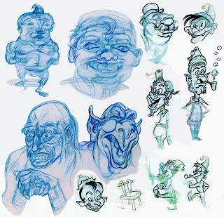
Some of these sketches are pretty loosey-goosey. My stuff usually ends up more finished-looking.. But I think the 2 weird figures at the Top Left were supposed to be a kind of strange Charles Burns -esque 'Santa Claus'?! I can't even remember why I did these..
The gaggle of more-finished "inked" figures are Elves, which I may still use in a future Christmas Card. I like how most of these turned out.. There's a nice contrast in the overall variety. I can recall the l'il marching ones, were adapted from a Frazetta 'Funny Animal' comic.. Always a fun exercise!
The other blue-pencil ones along the Bottom, were studies I'd done from a pre-code 50's Horror anthology, I purchased recently. In fact, I'm 99% sure the Ghoulie-Guy rubbing his hands, is from a Jack Cole story.. Cole was a brilliant artist whose artwork I cannot seem to get enough of!
The above sketch page, is a little more finished.. But again, the ideas/concepts were never incorporated into anything I felt was worth completing. The inked stuff along the top, are studies from a classic Wally Wood MAD story, entitled: "Wreck Of The Hesperus".. The idiot daughter in that one, never ceases to crack me up! hah
The bottom tier is quite Wood-sy, too. Essentially, more riffs on his style.. A couple of weird Alien figures, in all of their resplendent nekkid-ity!
The stern-looking Male faces thru the middle, were an idea I once had for a kind of 'NICK FURY' -style Super Spy. He was supposed to look a bit like Robert Mitchum, I guess? I can't recall.. But I did like the way all of the l'il Ass Chins turned out on these! haha

Anyways, hope you'll enjoy perusing some of the detritus from these projects?..
Because I'm pretty positive there'll be more Doodle Dumps, in my future!